Choosing the Perfect Colour Palette for Your Private Clinic's Website
- juwonadeyemi
- Apr 14, 2024
- 4 min read
Updated: Jun 27, 2024

In the digital age, your clinic's website serves as the virtual front door to your practice, welcoming patients and setting the tone for their experience. One of the most impactful elements of web design is colour choice – a seemingly simple decision that can have profound effects on how patients perceive your clinic. In this comprehensive guide, we'll explore the psychology behind colours and how to harness their healing power to create a website that evokes trust, comfort, and wellness for your patients.
The Psychology of Colour
Colours have the remarkable ability to influence our emotions, behaviours, and perceptions. Understanding the psychology behind each hue can help you strategically choose colours that align with your clinic's brand identity and evoke the desired emotional response from your patients.
Symbolising trust, professionalism, and tranquility, blue is a popular choice for healthcare websites. Incorporating shades of blue can instil a sense of calm and reliability in patients, making them feel safe and reassured.
Associated with growth, harmony, and health, green is often used to convey a sense of vitality and wellness. Using shades of green can create a serene and refreshing environment, inviting patients to feel rejuvenated and hopeful about their health journey.
Representing purity, cleanliness, and simplicity, white is a timeless choice for healthcare websites. A clean white background can lend an air of professionalism and sterility to your clinic's website, instilling confidence in patients about the quality of care they'll receive.
Creating a Harmonious Colour Palette
When selecting colours for your clinic's website, it's essential to create a harmonious palette that reflects your brand identity and resonates with your target audience. Consider the following tips for crafting a visually appealing and cohesive colour scheme:
Start by selecting a dominant colour that serves as the primary hue for your website. This colour should align with your clinic's brand personality and evoke the desired emotional response from patients.
Complement your dominant colour with one or two accent colours that enhance visual interest and create contrast. These accent colours can be used sparingly for buttons, links, and other interactive elements to draw attention and guide user interaction.
Keep in mind the importance of accessibility when choosing colours for your website. Ensure that text is legible against the background colour and that colour combinations meet accessibility standards for users with visual impairments.
Applying Colour Psychology to Your Website
Once you've selected a colour palette for your clinic's website, it's time to strategically apply these colours to different elements of your site to maximise their impact. Consider the following areas where colour can influence patient perceptions and behaviours:
Use your chosen colours consistently throughout your website to reinforce your clinic's brand identity and create a cohesive visual experience for patients.
Use contrasting colours for call-to-action buttons to make them stand out and encourage patients to take action, whether it's scheduling an appointment, signing up for a newsletter, or contacting your clinic.
Ensure sufficient contrast between background colours and text to improve readability and usability for patients browsing your website.
Colour Palettes For Private Clinic Websites
Now that we're done discussing the importance and the psychology of colour, here are ten colour palettes that are effective for healthcare websites:
This palette consists of calming shades of blue, reminiscent of the sky and ocean. It's perfect for clinics specialising in mental health, therapy, or relaxation services.

With tones of green inspired by nature, this palette is ideal for clinics focusing on holistic health, wellness, or alternative medicine.

A combination of crisp white and light blue hues creates a clean and professional look, suitable for general healthcare clinics or medical practices.

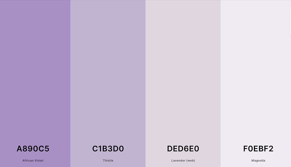
Shades of lavender and lilac evoke a sense of tranquility and are well-suited for clinics offering spa treatments, dermatology, or beauty services.

Warm tones of peach and beige create a soft and inviting atmosphere, making this palette suitable for paediatric clinics or family practices.

A mix of light and dark greys provides a contemporary and sophisticated look, perfect for upscale clinics or cosmetic surgery practices.

Vibrant shades of coral and teal add energy and vitality, making this palette perfect for clinics catering to women's health or fertility services.

Earthy tones like taupe and tan create a grounded and organic feel, making this palette suitable for holistic wellness centres or naturopathic clinics.

The elegant hues of orchid and mauve lend a touch of luxury, making this palette ideal for high-end clinics offering premium services.

Inspired by the sky, this palette features soft blue hues that evoke a sense of calm and serenity, making it suitable for meditation centres or mindfulness clinics.

Conclusion
Incorporating the right colours into your clinic's website can be a powerful tool for creating a welcoming and healing online environment for your patients. By understanding the psychology behind colours and strategically applying them to your website design, you can evoke feelings of trust, comfort, and wellness that resonate with your target audience. At 733Designs, we specialise in creating custom website solutions that enable private practitioners to showcase their unique brand identity and provide seamless patient experiences. Contact us today to learn how we can help bring your clinic's vision to life online.